The logo of a company is their identifier, the forefront to brand recognition, especially in this digital 2 second attention span era. The logo is the keystone to your brand identity, and it will eventually be on everything from coffee mugs to logo mats, baseball caps and mouse pads – not to mention business cards and your website.
Whether you’re a small company with a can do attitude, or a Fortune 500 company with a 20 person company that will debate the merits of serif or sans serif font, you can create a strong brand identity. Or a bad one. And there have some very public successes and failures in the digital sphere lately.
A great case study for a successful logo change would be Starbucks. As much as some may disdain the massive coffee chain, they’re obviously doing something right. And their brand equity is right up there with the major players – Starbucks could probably be called a major player themselves.
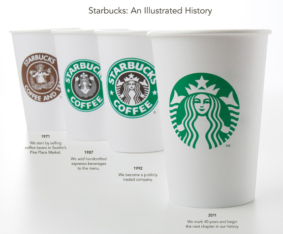
With their logo changes over the past years, especially, anyone with internet access can look up Starbucks and see their reasons for the logo redesign, and if you dig a little deeper, you can see all the research that they did in order to make these seemingly minute changes to their logo – though this time, Starbucks decided to drop their name entirely from the logo – focusing on the siren and the curves of the logo instead.
Interestingly enough, their extensive research shows that rounded logo designs are more appealing (somehow, I’m not sure of the research exactly) to much of the Asian market, which is where Starbucks is looking to expand the most in the coming years.
The changes to the Starbucks logo, and thus the Starbucks identity were well thought out, well crafted and not drastic – plus, Starbucks has the staying power to bounce back from the unhappiness from loyal customers that usually arises after any kind of brand repositioning.
The Gap, on the other hand, failed. Back in October 2010, Gap unveiled a new logo – as idsgn.org state quite succinctly, “Gap has built a solid brand since its humble beginnings in 1969 as a Levi’s and record store. So why trade that for Helvetica (and an awkwardly placed square)?”
From the way in which the public outcry of the new logo was handled and the response that was given by Gap, it seems like there wasn’t any particular thrust behind the new logo of Gap – it was just “more modern.” That is not a good enough reason to change the immediate identifier of your brand – especially one such as the Gap that has been around for decades. Gap did not seem to be entering new markets or adding new features to stores, nor did they really seem to be in fiscal trouble. So this redesign was completely out of the blue.
In reaction to the outcry, Gap initially offered to actually go with the reaction of the masses and crowd-source their designs for a new logo. Which was kind of a bad move, as it offended many in the design industry, because they would be offering their time and talent for free to fix a logo for a company when the ultimate original wasn’t broken. Gap gave the impression that their choice was not well thought out or well researched, and the American public reacted appropriately. All because of a logo change. Imagine that! Later in October Gap announced that it was returning to the original logo.
It goes to show that a logo is incredibly important, and even seemingly small changes can completely change your brand image. Whether you’re a small company or a large conglomeration, a brand identity and a logo and the ramifications of changing one cannot be ignored.
photos courtesy of Starbucks and Huffington Post
Anthony is a freelance writer, working with companies ranging from environmental lighting to industrial manufacturers and everything in between. He has always been fascinated with digital society and culture, making note of how brands permeate the landscape.